Example
In this example, we’ll walk through creating a Billing Model and predicting usage with it.
You can find a working example in the Example Code at the bottom of the page.
1) This example makes use of Matplotlib. Matplotlib is not a required dependency of OpenDSM.
2) If you run this example, it will download up to 150 MB of example data from the GitHub repo.
Imports🔗
import numpy as np
import matplotlib.pyplot as plt

import opendsm as odsm
from opendsm import eemeter as em
Loading data🔗
The essential inputs to OpenDSM library functions are the following:
- Meter baseline data named
observed - Meter reporting data
observed - Temperature data from a nearby weather station for both named
temperature - All data is expected to have a timezone-aware datetime index or column named
datetime
Users of the library are responsible for obtaining and formatting this data (to get weather data, see EEweather, which helps perform site to weather station matching and can pull and cache temperature data directly from public (US) data sources).
We utilize data classes to store meter data, perform transforms, and validate the data to ensure data compliance. The inputs into these data classes can either be pandas DataFrame if initializing the classes directly or Series if initializing the classes using .from_series.
The test data contained within the OpenDSM library is derived from NREL ComStock simulations.
If working with your own data instead of these samples, please refer directly to the excellent pandas documentation for instructions for loading data (e.g., pandas.read_csv).
Important notes about data🔗
- These models were developed and tested using temperature in units of °Fahrenheit. Please convert your temperatures accordingly
- It is expected that all data is trimmed to its appropriate time period (baseline and reporting) and does not contain extraneous datetimes
- The exception to this is that a billing period is assumed to start on the datetime in which it has a value and to end 1 day prior to the next datetime with a value with 1 final empty datetime signifying the end of the year resulting in 13 total datetimes for monthly billing data and 7 for bimonthly billing data
Let us begin by loading some example data. Here we use a built-in utility function to load some example data.
This function returns two dataframes of monthly billing electricity data, one for the baseline period and one for the reporting period.
If we inspect these dataframes, we will notice that there are 100 meters for you to experiment with, indexed by meter id and datetime.
Returns
id      datetime                   temperature       observed
108618  2018-01-01 00:00:00-06:00    -2.384038  257406.539278
        2018-01-02 00:00:00-06:00     1.730000            NaN
        2018-01-03 00:00:00-06:00    13.087946            NaN
        2018-01-04 00:00:00-06:00     4.743269            NaN
        2018-01-05 00:00:00-06:00     4.130577            NaN
                              ...          ...            ...
120841  2018-12-27 00:00:00-06:00    52.010625            NaN
        2018-12-28 00:00:00-06:00    35.270000            NaN
        2018-12-29 00:00:00-06:00    29.630000            NaN
        2018-12-30 00:00:00-06:00    34.250000            NaN
        2018-12-31 00:00:00-06:00    43.311250            NaN
Notice that there is only a single observed value and the rest are NaN. This is because these are daily average temperatures and only 12 data points out of the year have observed values. This is prior to the observed averaging that will take place later.
To simplify things, we will filter down to a single meter for the rest of the example. Let’s filter down to the 15th id.
n = 15

id = df_baseline.index.get_level_values(0).unique()[n]

df_baseline_n = df_baseline.loc[id]
df_reporting_n = df_reporting.loc[id]
If we inspect one of these dataframes, we will now notice that only a single meter is present with 365 days of data in each dataframe.
Returns
datetime                   temperature       observed
2018-01-01 00:00:00-06:00   -10.045000  143527.500929
2018-01-02 00:00:00-06:00    -4.712500            NaN
2018-01-03 00:00:00-06:00    11.352500            NaN
2018-01-04 00:00:00-06:00     0.972500            NaN
2018-01-05 00:00:00-06:00     3.147500            NaN
...                                ...            ...
2018-12-27 00:00:00-06:00    46.760000            NaN
2018-12-28 00:00:00-06:00    35.323125            NaN
2018-12-29 00:00:00-06:00    26.386250            NaN
2018-12-30 00:00:00-06:00    28.463750            NaN
2018-12-31 00:00:00-06:00    40.345250            NaN
Also notice the general structure of these dataframes for a single meter. We have three columns:
- A timezone-aware datetime index.
- A temperature column (float) in °Fahrenheit (be sure to convert any other units to °Fahrenheit first) and must be at least daily interval data.
- Observed meter usage (float). The example here is electricity data in kWh, but it could also be gas data.
- Billing data is reversed from a customer perspective. From a customer perspective, you pay for the month you used energy and so the bill is for the month prior. To model this, the start date should have the usage for a given month
We can stop to plot this data to get a better understanding of the general behavior of this meter.
fig, ax1 = plt.subplots(figsize=(7, 5))

color = 'blue'
ax1.set_xlabel('Datetime')
ax1.set_ylabel('Observed Usage', color=color)
ax1.plot(df_baseline_n.index, df_baseline_n['observed'], label='Observed Usage', color='color', marker='o', linestyle='-')
ax1.tick_params(axis='y', labelcolor=color)

ax2 = ax1.twinx()
color = 'orange'
ax2.set_ylabel('Temperature (F)', color=color)
ax2.plot(df_baseline_n.index, df_baseline_n['temperature'], label='Temperature (F)', color=color)
ax2.tick_params(axis='y', labelcolor=color)

fig.suptitle('Observed Usage and Temperature in the Baseline Period')
fig.tight_layout()
plt.show()
Returns
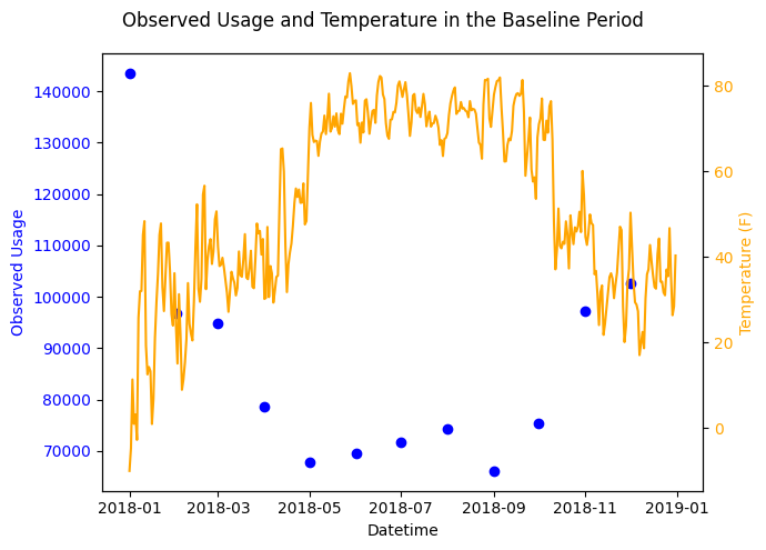
If we observe the data we can see a full year of data with observed usage peaking in the winter and lowering in the summer with warmer temperatures. It’s clear that this site is located in a colder climate and uses more electricity in the winter.
Loading Data into EEmeter Data Objects🔗
With our sample data loaded into dataframes, we can create our Baseline and Reporting Data objects. Note that only the baseline period is needed to fit a model, but we will use our reporting period data to predict against.
baseline_data = em.BillingBaselineData(df_baseline_n, is_electricity_data=True)
reporting_data = em.BillingReportingData(df_reporting_n, is_electricity_data=True)
These classes are critical to ensure standardized data loaded into the model. As with the daily model, these classes scan the data to check for data sufficiency and other criteria that might cause a model to be disqualified (unable to build a model of sufficient integrity).
In the case of the billing model, these classes also perform the observed averaging over the billing period. Let’s see what this looks like.
Returns
datetime                   season weekday_weekend  temperature     observed
2018-01-01 00:00:00-06:00  winter         weekday   -10.045000  4629.919385
2018-01-02 00:00:00-06:00  winter         weekday    -4.712500  4629.919385
2018-01-03 00:00:00-06:00  winter         weekday    11.352500  4629.919385
2018-01-04 00:00:00-06:00  winter         weekday     0.972500  4629.919385
2018-01-05 00:00:00-06:00  winter         weekday     3.147500  4629.919385
...                           ...             ...          ...          ...
2018-12-27 00:00:00-06:00  winter         weekday    46.760000  3312.268813
2018-12-28 00:00:00-06:00  winter         weekday    35.323125  3312.268813
2018-12-29 00:00:00-06:00  winter         weekend    26.386250  3312.268813
2018-12-30 00:00:00-06:00  winter         weekend    28.463750  3312.268813
2018-12-31 00:00:00-06:00  winter         weekday    40.345250  3312.268813
As these classes are derived from the daily data classes, season and weekday_weekend are still computed, but the biggest change from what we saw previously is that the observed column appears to be completely filled out. If you were to sum up the observed values over a given billing period it would equal the results of the input data. Let’s see how this looks compared to the last plot.
fig, ax1 = plt.subplots(figsize=(7, 5))

color = 'blue'
ax1.set_xlabel('Datetime')
ax1.set_ylabel('Observed Usage', color=color)
ax1.plot(baseline_data.df.index, baseline_data.df['observed'], label='Observed Usage', color=color, linestyle='-')
ax1.tick_params(axis='y', labelcolor=color)

ax2 = ax1.twinx()
color = 'orange'
ax2.set_ylabel('Temperature (F)', color=color)
ax2.plot(baseline_data.df.index, baseline_data.df['temperature'], label='Temperature (F)', color=color)
ax2.tick_params(axis='y', labelcolor=color)

fig.suptitle('Observed Usage and Temperature in the Baseline Period')
fig.tight_layout()
plt.show()
Returns
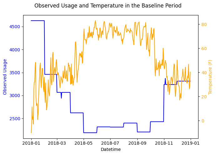
In this plot the observed usage is now continuous in time with discontinuities where the billing periods change.
With data classes successfully instantiated, we can also check for any disqualifications or warnings before moving on to the model fitting step.
print(f"Disqualifications: {baseline_data.disqualification}")
print(f"Warnings:          {baseline_data.warnings}")
Returns
From this, we can see that no disqualifications are present but there are some warnings to be aware of as we proceed. Warnings will necessarily stop us from creating a model.
Creating the Model🔗
The billing model follows the general process of:
- Initialize
- Fit
- Predict
We can do this easily as follows:
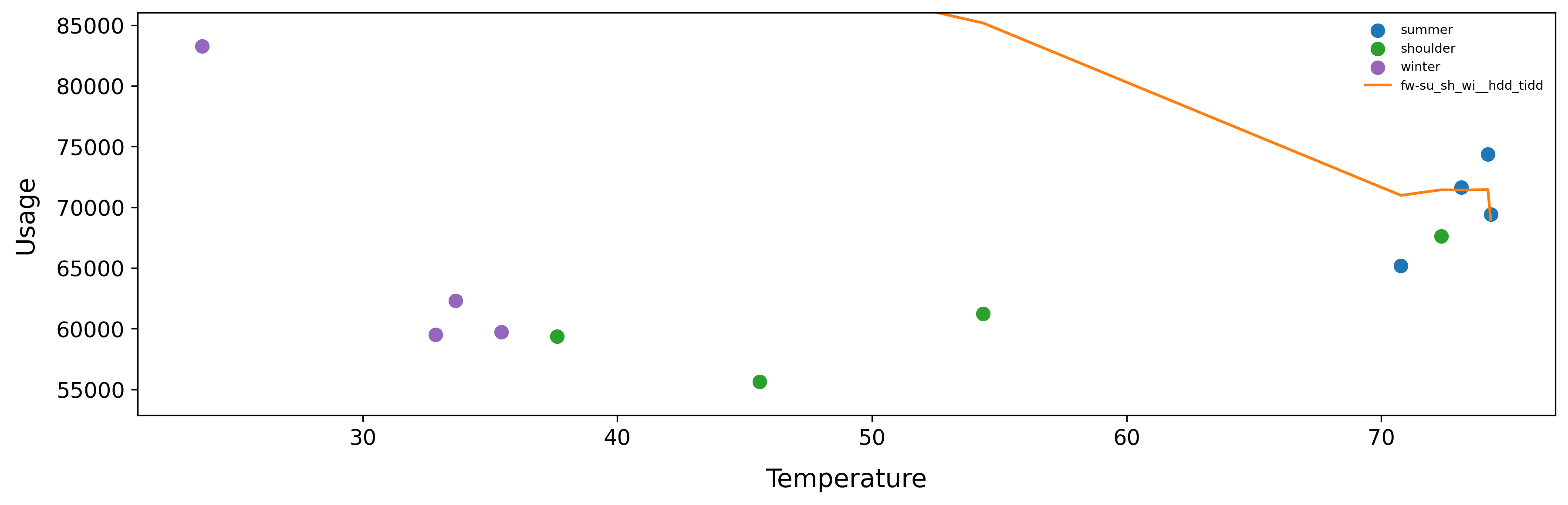
Before we move to predicting against a dataframe, we can actually use the built in plot function (requiring Matplotlib) to plot the performance of the model against the provided data.
Returns
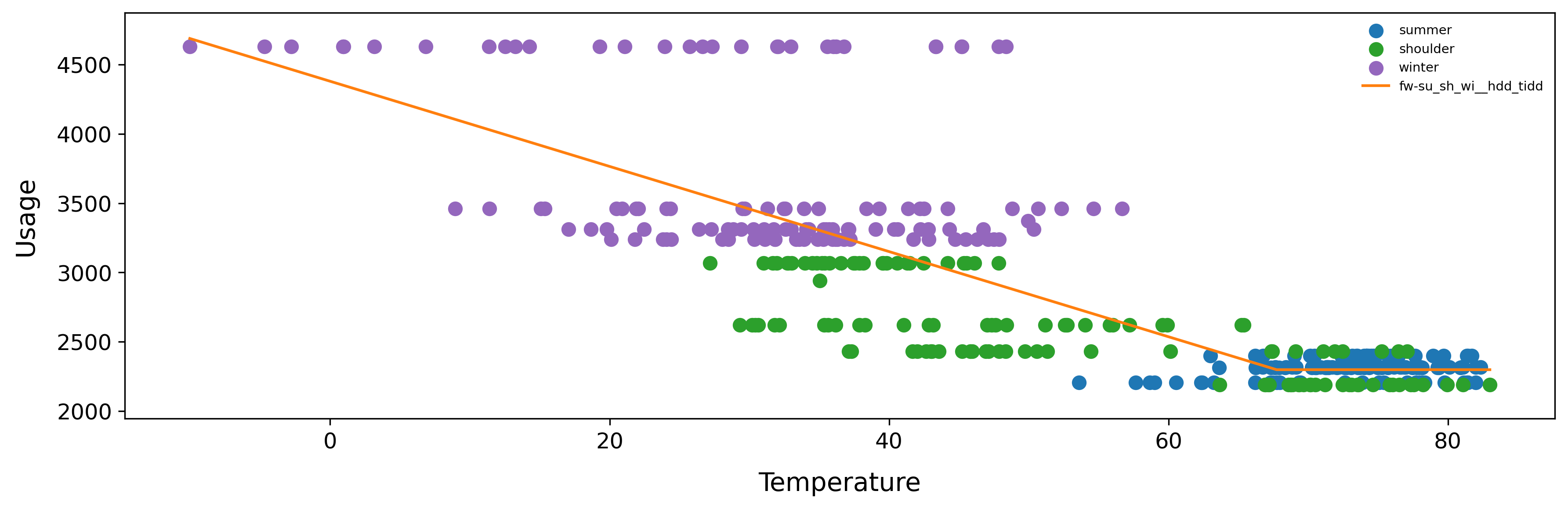
It’s not always very intuitive to input billing data and then to see daily plots, so the plot function has an optional input where you can specify monthly or bimonthly to aggregate to the specified interval.
Returns
While it might initially be concerning that this model does not appear to look like any of the Model Archetypes, remember that this is utilizing the daily model under the hood. We’ve found through extensive testing that this model is more accurate than a CalTRACK model that does follow those model archetypes on a billing interval basis (References pg. 28).
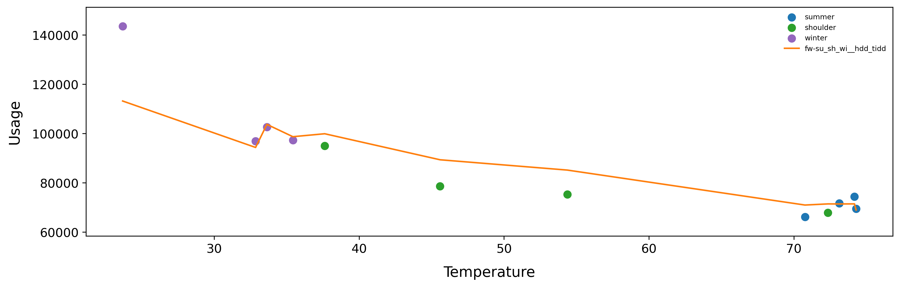
We can also use this function to plot the model prediction against the reporting period as follows:
Returns
In this plot we can see that the site is using significantly less energy in colder temperatures compared to the model / baseline period. Perhaps this site installed an efficiency intervention that saves energy in colder temperatures?
Predicting with the Model and Calculating Savings🔗
With our fit model, we can now predict across a given reporting period. The billing model predict method has the same functionality as the plot function. Let’s skip straight to using that.
Returns
datetime season temperature observed predicted predicted_unc heating_load cooling_load model_split model_type
2019-01-01 00:00:00-06:00 winter 23.684855 83259.561689 113204.189203 4817.570659 41972.011102 0.0 fw-su_sh_wi hdd_tidd
2019-02-01 00:00:00-06:00 winter 32.858562 59500.977283 94352.449401 4578.532084 30013.707891 0.0 fw-su_sh_wi hdd_tidd
2019-03-01 00:00:00-06:00 shoulder 37.632207 59374.674004 99912.353102 4817.570659 28680.175001 0.0 fw-su_sh_wi hdd_tidd
2019-04-01 00:00:00-05:00 shoulder 45.590826 55628.416668 89349.469105 4739.230955 20415.103201 0.0 fw-su_sh_wi hdd_tidd
2019-05-01 00:00:00-05:00 shoulder 72.356294 67624.123278 71439.541663 4817.570659 207.363562 0.0 fw-su_sh_wi hdd_tidd
From here, we can easily calculate savings by subtracting observed usage from predicted usage.
df_results['savings'] = df_results['predicted'] - df_results['observed']
print(f"Predicted Usage (kWh): {round(df_results['predicted'].sum(), 2)}")
print(f"Observed Usage (kWh): {round(df_results['observed'].sum(), 2)}")
print(f"Savings (kWh): {round(df_results['savings'].sum(), 2)}")
Model Serialization🔗
After creating a model, we can also serialize it for storage and read it back in later.
Returns
{"submodels": {"fw-su_sh_wi": {"coefficients": {"model_type": "hdd_tidd", "intercept": 2297.8121967963853, "hdd_bp": 67.72680897508171, "hdd_beta": -30.741956585408087, "hdd_k": null, "cdd_bp": null, "cdd_beta": null, "cdd_k": null}, "temperature_constraints": {"T_min": -10.045, "T_max": 83.00500000000001, "T_min_seg": 12.545, "T_max_seg": 81.155}, "f_unc": 865.2612331776701}}, "info": {"metrics": {"num_model_params": 3, "wrmse": 419.24394756674826, "n": 365, "n_prime": 27.66964273507515, "ddof": 362, "ddof_autocorr": 24.66964273507515, "observed": {"sum": 1038753.1599362098, "mean": 2845.899068318383, "variance": 488312.02991311357, "std": 698.7932669345875, "cvstd": 0.24554393889573123, "sum_squared": 3134420540.9935226, "median": 2429.3228342442544, "MAD_scaled": 333.1117536358844, "iqr": 926.6745388691215, "skew": 1.2625298968979632, "kurtosis": 0.9156722074740755}, "predicted": {"sum": 1038737.259890548, "mean": 2845.8555065494465, "variance": 312476.71880654804, "std": 558.996170654637, "cvstd": 0.19642464958890718, "sum_squared": 3070150153.281991, "median": 2788.524855779726, "MAD_scaled": 698.6505031914634, "iqr": 966.0076038629841, "skew": 0.7165071708387074, "kurtosis": -0.2538771406240987}, "residuals": {"sum": 15.900045661750482, "mean": 0.04356176893630269, "variance": 175765.48567372267, "std": 419.2439453035937, "cvstd": 9624.125822728289, "sum_squared": 64154402.963542886, "median": -5.880697581936602, "MAD_scaled": 181.868534696836, "iqr": 242.47336933796623, "skew": 1.6831253772500656, "kurtosis": 4.7581863103152955}, "max_error": 1769.9811033304532, "mae": 257.92400477097476, "nmae": 0.09063006051137991, "pnmae": 0.2783328924583764, "medae": 128.54916011813293, "mbe": 0.04356176893630269, "nmbe": 1.530685659981714e-05, "pnmbe": 4.700870382115367e-05, "sse": 64154402.963542886, "mse": 175765.4875713504, "rmse": 419.24394756674826, "rmse_autocorr": 1522.6898682446667, "rmse_adj": 420.9775619128606, "rmse_autocorr_adj": 1612.619116623234, "cvrmse": 0.14731511466233266, "cvrmse_autocorr": 0.535047038454674, "cvrmse_adj": 0.14792427693565838, "cvrmse_autocorr_adj": 0.5666466300845014, "pnrmse": 0.45241768278038336, "pnrmse_autocorr": 1.6431765462153516, "pnrmse_adj": 0.45428847373599546, "pnrmse_autocorr_adj": 1.7402216732869484, "r_squared": 0.6400549832773262, "r_squared_adj": 0.6370637504513761, "mape": 0.08155878354581031, "smape": 0.08173992723397144, "wape": 0.09063006051137991, "swape": 0.09063075414735854, "maape": 0.08048769260024743, "nse": 0.6400549714029681, "nnse": 0.7353238395463939, "kge": 0.7171513388922812, "a10": 0.726027397260274, "a20": 0.8767123287671232, "a30": 0.9643835616438357, "wi": 0.8794028739871067, "index_of_agreement": 0.7770521795412928, "pearson_r": 0.8000343638102831, "pi": 0.7035525188232095, "pi_rating": "good", "explained_variance_score": 0.6400549752890646}, "baseline_timezone": "America/Chicago", "disqualification": [], "warnings": [{"qualified_name": "eemeter.sufficiency_criteria.unable_to_confirm_daily_temperature_sufficiency", "description": "Cannot confirm that pre-aggregated temperature data had sufficient hours kept", "data": {}}]}, "settings": {"developer_mode": true, "algorithm_choice": "nlopt_sbplx", "initial_guess_algorithm_choice": "nlopt_direct", "full_model": "hdd_tidd_cdd", "allow_smooth_model": false, "alpha_minimum": -100, "alpha_selection": 2, "alpha_final_type": "last", "alpha_final": 2.0, "final_bounds_scalar": 1, "regularization_alpha": 0.001, "regularization_percent_lasso": 1, "segment_minimum_count": 10, "maximum_slope_oom_scalar": 2, "initial_step_percentage": 0.1, "split_selection": {"criteria": "bic", "penalty_multiplier": 0.24, "penalty_power": 2.061, "allow_separate_summer": false, "allow_separate_shoulder": false, "allow_separate_winter": false, "allow_separate_weekday_weekend": false, "reduce_splits_by_gaussian": false, "reduce_splits_num_std": null}, "season": {"january": "winter", "february": "winter", "march": "shoulder", "april": "shoulder", "may": "shoulder", "june": "summer", "july": "summer", "august": "summer", "september": "summer", "october": "shoulder", "november": "winter", "december": "winter", "options": ["summer", "shoulder", "winter"]}, "weekday_weekend": {"monday": "weekday", "tuesday": "weekday", "wednesday": "weekday", "thursday": "weekday", "friday": "weekday", "saturday": "weekend", "sunday": "weekend", "options": ["weekday", "weekend"]}, "uncertainty_alpha": 0.1, "cvrmse_threshold": 1, "pnrmse_threshold": 1.6}}
Afterwards, we can instantiate the model as follows:
Automatic Sufficiency Checking🔗
Two of the core features of the OpenDSM Data and Model classes are automatic data sufficiency and model sufficiency checking. This ensures that only acceptable data and models are allowed to be used for making measurements. Let’s show an example of how this works by introducing too many NaN values into the observed data of the prior example.
# set rows 1:38 of observed to nan
df_baseline_n_dq = df_baseline_n.copy()
df_baseline_n_dq.loc[df_baseline_n_dq.index[1:38], "observed"] = np.nan
baseline_data_DQ = em.BillingBaselineData(df_baseline_n_dq, is_electricity_data=True)
print(f"Disqualifications: {baseline_data_DQ.disqualification}")
Returns
If this data were to try to be fit on it would return an error by default.
try:
billing_model = em.BillingModel().fit(baseline_data_DQ)
except Exception as e:
print(f"Exception: {e}")
In some circumstances it may still be possible to fit a model on disqualified data for investigative purposes. This can be done by setting the ignore_disqualification flag to True.
Please remember that enabling ignore_disqualification or making any changes to the model configuration fundamentally alters the model and such models are not approved for measurement purposes.
Example Code🔗
import numpy as np
import matplotlib.pyplot as plt
import opendsm as odsm
from opendsm import eemeter as em
df_baseline, df_reporting = odsm.test_data.load_test_data("monthly_treatment_data")
n = 15
id = df_baseline.index.get_level_values(0).unique()[n]
df_baseline_n = df_baseline.loc[id]
df_reporting_n = df_reporting.loc[id]
baseline_data = em.BillingBaselineData(df_baseline_n, is_electricity_data=True)
reporting_data = em.BillingReportingData(df_reporting_n, is_electricity_data=True)
print(f"Disqualifications: {baseline_data.disqualification}")
print(f"Warnings: {baseline_data.warnings}")
billing_model = em.BillingModel()
billing_model.fit(baseline_data)
# Save model to json
saved_model = billing_model.to_json()
loaded_model = em.BillingModel.from_json(saved_model)
# Model results
billing_model.plot(baseline_data, aggregation="monthly")
billing_model.plot(reporting_data, aggregation="monthly")
df_results = billing_model.predict(reporting_data, aggregation="monthly")
df_results['savings'] = df_results['predicted'] - df_results['observed']
print(f"Predicted Usage (kWh):  {round(df_results['predicted'].sum(), 2)}")
print(f"Observed Usage (kWh):   {round(df_results['observed'].sum(), 2)}")
print(f"Savings (kWh):          {round(df_results['savings'].sum(), 2)}")